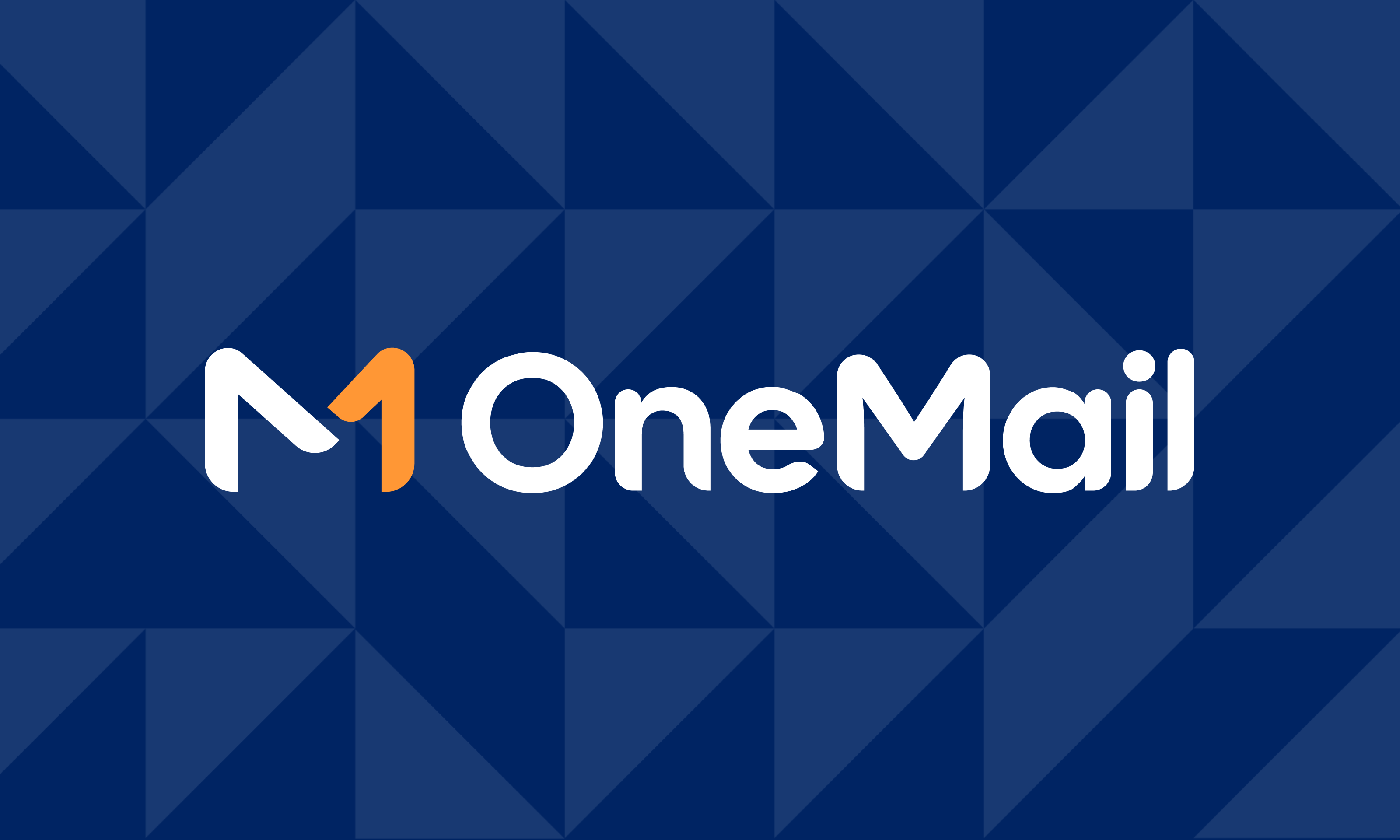
OneMail Branding
This project was done as a part of ThemeWagon Ltd.
Time: Jan, 2026
Role
Lead Designer
Status
Handed
Type
WebApp
About The Brand
OneMail is a powerful email marketing SaaS platform designed to help businesses of all sizes connect with their audience through engaging campaigns. With an intuitive interface and robust automation tools, OneMail makes it easy to create, personalize, and send email campaigns that drive results.
Key Highlights
Campaign Builder: Drag-and-drop editor for designing beautiful, responsive emails without coding.Subscriber Management: Organize, segment, and grow your mailing lists with ease.
Automation: Schedule campaigns, set up drip sequences, and trigger emails based on user behavior.
Analytics Dashboard: Track open rates, click-throughs, conversions, and optimize performance with real-time insights.
Scalability: Whether you’re a startup or an enterprise, OneMail adapts to your marketing needs.
Key Tasks

Understand the context, create moodboard, and finalize the brand design from scratch
Create a full guideline that covers all the major aspects of this branding
Ensure the details within the guidelines are maintained so that the future designers can follow easily

Logo
The OneMail logo is versatile and recognizable. It embodies simplicity and innovation, reflecting our commitment to effective email marketing. It consists of an icon and logotype.

Logo variations
Explains the main variations of logos
Primary logo
This version should be used whenever it is possible. If there is enough clearspace, using this logo should be prioritized.

Secondary logo
This version should be used whenever there is not enough space for the main logo, but the company name is still needed to be shown.

Logomark
This version should be for used for the best utilization of space. Whenever the company name with logo is visible nearby, or it can be confirmed that the company is well-recognised in some kind of scenario, this logo can be used.

Logo use cases (The dos)
How the logo variants can be used.
Original logo on white background


Variant on dark background


Variant on emphasised background

During the following condition, the logo can appear in white or black:
- When using two colours of the logo is not possible, such as using the logo on a printed media where a monochromatic colour printer is in used.
- When it is placed on a background where no other variations from above is working.


Logo use cases (The don’ts)
What kind of usage needs to be avoided
Never overprint something on top of the logo, and do not use the logo as a background pattern.

BEST

Do not crop the logo

Do not outline the logo

Do not use the wordmark by itself

Do not reduce the opacity of the logo

Do not use drop shadow beneath the logo

Do not use unofficial colors

Do not crop the logo

Do not change the typeface

OneMail

Do not use the logo on a different background other than the recommended ones


Do not move, rotate, flip, or alter the whole or part of the logo elements

Clearspace
Amount of breathing space the three main categories of the logo should have around them

1/2
1/2


1/3
1/3
Partner Lockup
Things to be considered when partnered with another brand
Horizontal
The paired logo should be optically balanced with the OneMail logo. The distance between these two logos will be thrice as the distance between the logomark and the text


x
x*3
Vertical
The paired logo should be optically balanced with the OneMail logo. The distance between these two logos will be 2/3 less than the height of the logo. Both the logos will be center aligned.
x
x
x*3/2


Special case
Making the logos optically balanced should be the number one priority. The distance between the two logos should be maintained always. However, the heights do not need to match in every context.

x
x*3


x
x*3


Color
OneMail uses a vibrant, energetic orange as its primary color, and a contrasting deep blue as its secondary color to balance the visual. Together, they coexist with a pure white and the shades of a bluish-grey to achieve a sharp, high contrast look across the branding.
Primary
Pastel Orange
#FF9735
Used to represent the energy and speed needed to represent the rapidness of the service the company can provide
- Main accent colour
- Will be used for maximum attention
Secondary
Midnight Blue
#002463
In contrast with the primary orange, this deep blue represent the professionalism and sincerity of the company
- Used for elements that requires less than maximum, but still a significant amount of attention
Background
Pure White
#FFFFFF
This clear, full white colour is used in the main background to represent the clarity of the company
- The main body color, which will typically cover the majority of the screen
Elevation 1
Ghost Grey
#F7F9FC
This fade grey color will be used for highlighting background, to pass them as elevations.
- Will be used on cards
- Will be used for subtle UI elements, such as dividers and border.
Elevation 2
Porcelain Grey
#ECF0F7
This slightly darker grey color will be used for emphasizing backgrounds, but still keeping it in a mild-subtle level
- Will be used on components
- Will be used for emphasising backgrounds on elevation 1
Neutral Primary
Bluish Charcoal
#001231
This dark colour is used in texts to create a high contrast with the background for maximum legibility and attention.
- Will be used for primary texts.
- Will be used in titles, headings and subtitles/
Neutral Secondary
Bright Grey
#314059
This lighter grey color will be used for texts requiring less amount of attention
- Will be used for secondary text
- Primarily used for body text
Color pairings
How the colors are supposed to be used for texts and backgrounds
Aa
Neutral on Background
Aa
Pure White on Neutral
Aa
Neutral on Elevation
Aa
Secondary on Background
Aa
Pure White on Secondary
Aa
Secondary on Primary
Typography
Typography in OneMail was meant to convey seriousness while keeping a slight bit of casual tone. Which is why the following sans-serif typefaces, that balance carefully between straight and curved lines in their designs, were chosen.
Cal Sans
Used for display texts
The quick brown fox jumps over the lazy dog
Commissioner
Used for heading, body and caption texts
The quick brown fox jumps over the lazy dog
IBM Plex Mono
Used for code snippets
The quick brown fox jumps over the lazy dog
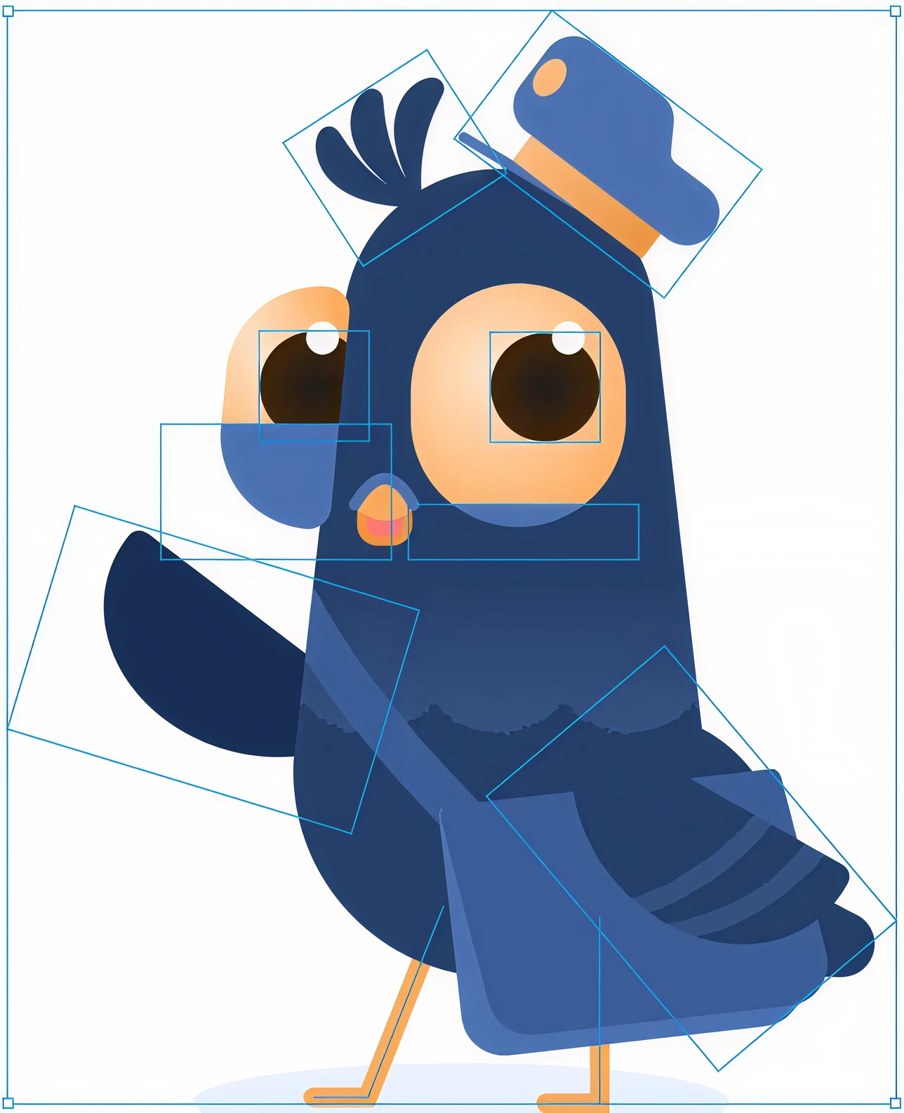
Mascot
Typography in OneMail was meant to convey seriousness while keeping a slight bit of casual tone. Which is why the following sans-serif typefaces, that balance carefully between straight and curved lines in their designs, were chosen.
Interested to know more about this mascot project?
Click here

PG1
The Personal Guide for OneMail
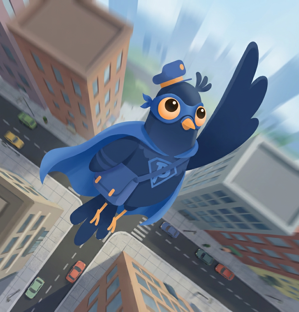
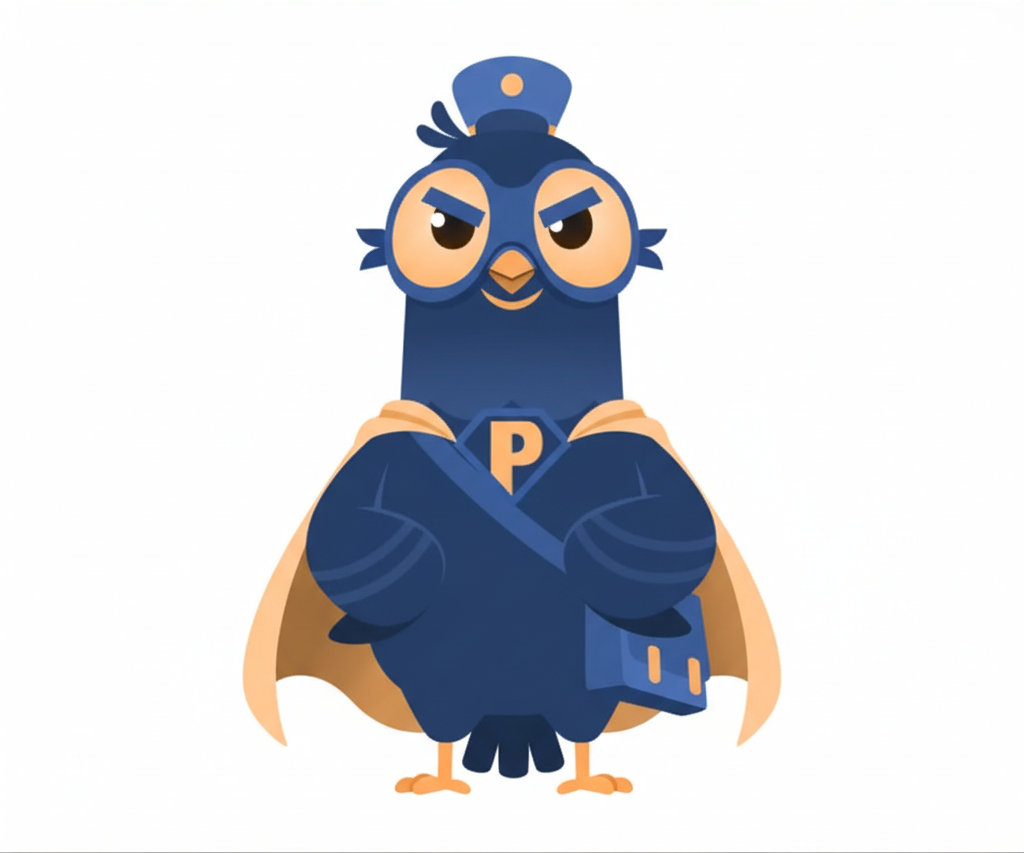
Meet PG1, the cheerful messenger pigeon sporting a postman hat and a letter bag! He pops up throughout the app to assist users, offering helpful tips and guidance on key features.

PG1 is drawn using vector layers and simple shapes. Because of this, these layers can be moved, rotated and scaled to give PG1 different gestures and a wide range of emotions.
Being vector-based allows PG1 to have a large scope to be editable. This leaves more chances for his design to grow in the future.

Friendly

Excited

Confident

Thinking

Bored

Mischievous
What can be done

Following changes can be implemented as long as they fit the context, and the main characteristics are still recognizable
- Proportions of the character
- Extra apparels can be added.
- Extra elements, such as speed lines, can be added.
- Added elements should have colors from the official palette. Opacity can be adjusted as per requirement.

The character should be placed on backgrounds that create high contrast. Design elements ensuring this can be added in the backgrounds
- On clean white backgrounds.
- On light grey backgrounds.

What can not be done

The character can not be placed on backgrounds that provide low contrast

The character can not be placed on busy backgrounds. Character elements can not altered in a way that it becomes unrecognizable.
Showing the character from a different angle that alters the intended look is prohibited
Interested to know more about this mascot project?
Click here
©
2025


Aurora – Admin Dashboard and Web App Template
This project was done as a part of ThemeWagon Ltd.
Time: Jan, 2026
Role
Lead Designer
Status
Handed
Type
WebApp
About The Brand
OneMail is a powerful email marketing SaaS platform designed to help businesses of all sizes connect with their audience through engaging campaigns. With an intuitive interface and robust automation tools, OneMail makes it easy to create, personalize, and send email campaigns that drive results.
Key Highlights
Campaign Builder: Drag-and-drop editor for designing beautiful, responsive emails without coding.Subscriber Management: Organize, segment, and grow your mailing lists with ease.
Automation: Schedule campaigns, set up drip sequences, and trigger emails based on user behavior.
Analytics Dashboard: Track open rates, click-throughs, conversions, and optimize performance with real-time insights.
Scalability: Whether you’re a startup or an enterprise, OneMail adapts to your marketing needs.
Key Tasks
Understand the context, create moodboard, and finalize the brand design from scratch
Create a full guideline that covers all the major aspects of this branding
Ensure the details within the guidelines are maintained so that the future designers can follow easily

Logo
The OneMail logo is versatile and recognizable. It embodies simplicity and innovation, reflecting our commitment to effective email marketing. It consists of an icon and logotype.

Logo variations
Explains the main variations of logos
Primary logo
This version should be used whenever it is possible. If there is enough clearspace, using this logo should be prioritized.

Secondary logo
This version should be used whenever there is not enough space for the main logo, but the company name is still needed to be shown.

Logomark
This version should be for used for the best utilization of space. Whenever the company name with logo is visible nearby, or it can be confirmed that the company is well-recognised in some kind of scenario, this logo can be used.
Logo use cases (The dos)
How the logo variants can be used.
Original logo on white background


Variant on dark background


Variant on emphasised background
During the following condition, the logo can appear in white or black:
- When using two colours of the logo is not possible, such as using the logo on a printed media where a monochromatic colour printer is in used.
- When it is placed on a background where no other variations from above is working.


Logo use cases (The don’ts)
What kind of usage needs to be avoided
Never overprint something on top of the logo, and do not use the logo as a background pattern.
BEST

Do not crop the logo
Do not outline the logo

Do not use the wordmark by itself
Do not reduce the opacity of the logo

Do not use drop shadow beneath the logo

Do not use unofficial colors

Do not crop the logo
Do not change the typeface

OneMail

Do not use the logo on a different background other than the recommended ones

Do not move, rotate, flip, or alter the whole or part of the logo elements

Clearspace
Amount of breathing space the three main categories of the logo should have around them

1/2
1/2


1/3
1/3
Partner Lockup
Things to be considered when partnered with another brand
Horizontal
The paired logo should be optically balanced with the OneMail logo. The distance between these two logos will be thrice as the distance between the logomark and the text


x
x*3
Vertical
The paired logo should be optically balanced with the OneMail logo. The distance between these two logos will be 2/3 less than the height of the logo. Both the logos will be center aligned.
x
x
x*3/2


Special case
Making the logos optically balanced should be the number one priority. The distance between the two logos should be maintained always. However, the heights do not need to match in every context.
x
x*3


x
x*3

Color
OneMail uses a vibrant, energetic orange as its primary color, and a contrasting deep blue as its secondary color to balance the visual. Together, they coexist with a pure white and the shades of a bluish-grey to achieve a sharp, high contrast look across the branding.
Primary
Pastel Orange
#FF9735
Used to represent the energy and speed needed to represent the rapidness of the service the company can provide
- Main accent colour
- Will be used for maximum attention
Secondary
Midnight Blue
#002463
In contrast with the primary orange, this deep blue represent the professionalism and sincerity of the company
- Used for elements that requires less than maximum, but still a significant amount of attention
Background
Pure White
#FFFFFF
This clear, full white colour is used in the main background to represent the clarity of the company
- The main body color, which will typically cover the majority of the screen
Elevation 1
Ghost Grey
#F7F9FC
This fade grey color will be used for highlighting background, to pass them as elevations.
- Will be used on cards
- Will be used for subtle UI elements, such as dividers and border.
Elevation 2
Porcelain Grey
#ECF0F7
This slightly darker grey color will be used for emphasizing backgrounds, but still keeping it in a mild-subtle level
- Will be used on components
- Will be used for emphasising backgrounds on elevation 1
Neutral Primary
Bluish Charcoal
#001231
This dark colour is used in texts to create a high contrast with the background for maximum legibility and attention.
- Will be used for primary texts.
- Will be used in titles, headings and subtitles/
Neutral Secondary
Bright Grey
#314059
This lighter grey color will be used for texts requiring less amount of attention
- Will be used for secondary text
- Primarily used for body text
Color pairings
How the colors are supposed to be used for texts and backgrounds
Aa
Neutral on Background
Aa
Pure White on Neutral
Aa
Neutral on Elevation
Aa
Secondary on Background
Aa
Pure White on Secondary
Aa
Secondary on Primary
Typography
Typography in OneMail was meant to convey seriousness while keeping a slight bit of casual tone. Which is why the following sans-serif typefaces, that balance carefully between straight and curved lines in their designs, were chosen.
Cal Sans
Used for display texts
The quick brown fox jumps over the lazy dog
Commissioner
Used for heading, body and caption texts
The quick brown fox jumps over the lazy dog
IBM Plex Mono
Used for code snippets
The quick brown fox jumps over the lazy dog
Mascot
Typography in OneMail was meant to convey seriousness while keeping a slight bit of casual tone. Which is why the following sans-serif typefaces, that balance carefully between straight and curved lines in their designs, were chosen.
Interested to know more about this mascot project?
Click here
PG1
The Personal Guide for OneMail
Meet PG1, the cheerful messenger pigeon sporting a postman hat and a letter bag! He pops up throughout the app to assist users, offering helpful tips and guidance on key features.
PG1 is drawn using vector layers and simple shapes. Because of this, these layers can be moved, rotated and scaled to give PG1 different gestures and a wide range of emotions.
Being vector-based allows PG1 to have a large scope to be editable. This leaves more chances for his design to grow in the future.
Friendly
Excited
Confident
Thinking
Bored
Mischievous
What can be done
Following changes can be implemented as long as they fit the context, and the main characteristics are still recognizable
- Proportions of the character
- Extra apparels can be added.
- Extra elements, such as speed lines, can be added.
- Added elements should have colors from the official palette. Opacity can be adjusted as per requirement.
The character should be placed on backgrounds that create high contrast. Design elements ensuring this can be added in the backgrounds
- On clean white backgrounds.
- On light grey backgrounds.
What can not be done
The character can not be placed on backgrounds that provide low contrast
The character can not be placed on busy backgrounds. Character elements can not altered in a way that it becomes unrecognizable.
Showing the character from a different angle that alters the intended look is prohibited
Interested to know more about this mascot project?
Click here
See more of my stuffs
©
2025
Made with Figma Sites, blood, tears and coffee ☕
OneMail Branding
This project was done as a part of ThemeWagon Ltd.
Time: Jan, 2026
Role
Lead Designer
Status
Handed
Type
WebApp
About The Brand
OneMail is a powerful email marketing SaaS platform designed to help businesses of all sizes connect with their audience through engaging campaigns. With an intuitive interface and robust automation tools, OneMail makes it easy to create, personalize, and send email campaigns that drive results.
Key Highlights
Campaign Builder: Drag-and-drop editor for designing beautiful, responsive emails without coding.Subscriber Management: Organize, segment, and grow your mailing lists with ease.
Automation: Schedule campaigns, set up drip sequences, and trigger emails based on user behavior.
Analytics Dashboard: Track open rates, click-throughs, conversions, and optimize performance with real-time insights.
Scalability: Whether you’re a startup or an enterprise, OneMail adapts to your marketing needs.
Key Tasks
Understand the context, create moodboard, and finalize the brand design from scratch
Create a full guideline that covers all the major aspects of this branding
Ensure the details within the guidelines are maintained so that the future designers can follow easily

Logo
The OneMail logo is versatile and recognizable. It embodies simplicity and innovation, reflecting our commitment to effective email marketing. It consists of an icon and logotype.
Logo variations
Explains the main variations of logos
Primary logo
This version should be used whenever it is possible. If there is enough clearspace, using this logo should be prioritized.
Secondary logo
This version should be used whenever there is not enough space for the main logo, but the company name is still needed to be shown.
Logomark
This version should be for used for the best utilization of space. Whenever the company name with logo is visible nearby, or it can be confirmed that the company is well-recognised in some kind of scenario, this logo can be used.

Logo use cases (The dos)
How the logo variants can be used.
Original logo on white background

Variant on dark background

Variant on emphasised background
During the following condition, the logo can appear in white or black:
- When using two colours of the logo is not possible, such as using the logo on a printed media where a monochromatic colour printer is in used.
- When it is placed on a background where no other variations from above is working.


Logo use cases (The don’ts)
What kind of usage needs to be avoided
Never overprint something on top of the logo, and do not use the logo as a background pattern.

BEST

Do not crop the logo

Do not outline the logo

Do not use the wordmark by itself
Do not reduce the opacity of the logo


Do not use drop shadow beneath the logo
Do not use unofficial colors
Do not crop the logo
Do not change the typeface
OneMail

Do not use the logo on a different background other than the recommended ones


Do not move, rotate, flip, or alter the whole or part of the logo elements
Clearspace
Amount of breathing space the three main categories of the logo should have around them
1/2
1/2
1/3
1/3
Partner Lockup
Things to be considered when partnered with another brand
Horizontal
The paired logo should be optically balanced with the OneMail logo. The distance between these two logos will be thrice as the distance between the logomark and the text
x
x*3
Vertical
The paired logo should be optically balanced with the OneMail logo. The distance between these two logos will be 2/3 less than the height of the logo. Both the logos will be center aligned.
x
x
x*3/2
Special case
Making the logos optically balanced should be the number one priority. The distance between the two logos should be maintained always. However, the heights do not need to match in every context.
x
x*3
x
x*3
Color
OneMail uses a vibrant, energetic orange as its primary color, and a contrasting deep blue as its secondary color to balance the visual. Together, they coexist with a pure white and the shades of a bluish-grey to achieve a sharp, high contrast look across the branding.
Primary
Pastel Orange
#FF9735
Used to represent the energy and speed needed to represent the rapidness of the service the company can provide
- Main accent colour
- Will be used for maximum attention
Secondary
Midnight Blue
#002463
In contrast with the primary orange, this deep blue represent the professionalism and sincerity of the company
- Used for elements that requires less than maximum, but still a significant amount of attention
Background
Pure White
#FFFFFF
This clear, full white colour is used in the main background to represent the clarity of the company
- The main body color, which will typically cover the majority of the screen
Elevation 1
Ghost Grey
#F7F9FC
This fade grey color will be used for highlighting background, to pass them as elevations.
- Will be used on cards
- Will be used for subtle UI elements, such as dividers and border.
Elevation 2
Porcelain Grey
#ECF0F7
This slightly darker grey color will be used for emphasizing backgrounds, but still keeping it in a mild-subtle level
- Will be used on components
- Will be used for emphasising backgrounds on elevation 1
Neutral Primary
Bluish Charcoal
#001231
This dark colour is used in texts to create a high contrast with the background for maximum legibility and attention.
- Will be used for primary texts.
- Will be used in titles, headings and subtitles/
Neutral Secondary
Bright Grey
#314059
This lighter grey color will be used for texts requiring less amount of attention
- Will be used for secondary text
- Primarily used for body text
Color pairings
How the colors are supposed to be used for texts and backgrounds
Aa
Neutral on Background
Aa
Pure White on Neutral
Aa
Neutral on Elevation
Aa
Secondary on Background
Aa
Pure White on Secondary
Aa
Secondary on Primary
Typography
Typography in OneMail was meant to convey seriousness while keeping a slight bit of casual tone. Which is why the following sans-serif typefaces, that balance carefully between straight and curved lines in their designs, were chosen.
Cal Sans
Used for display texts
The quick brown fox jumps over the lazy dog
Commissioner
Used for heading, body and caption texts
The quick brown fox jumps over the lazy dog
IBM Plex Mono
Used for code snippets
The quick brown fox jumps over the lazy dog
Mascot
Typography in OneMail was meant to convey seriousness while keeping a slight bit of casual tone. Which is why the following sans-serif typefaces, that balance carefully between straight and curved lines in their designs, were chosen.
Interested to know more about this mascot project?
Click here
PG1
The Personal Guide for OneMail
Meet PG1, the cheerful messenger pigeon sporting a postman hat and a letter bag! He pops up throughout the app to assist users, offering helpful tips and guidance on key features.
PG1 is drawn using vector layers and simple shapes. Because of this, these layers can be moved, rotated and scaled to give PG1 different gestures and a wide range of emotions.
Being vector-based allows PG1 to have a large scope to be editable. This leaves more chances for his design to grow in the future.
Friendly
Excited
Confident
Thinking
Bored
Mischievous
What can be done
Following changes can be implemented as long as they fit the context, and the main characteristics are still recognizable
- Proportions of the character
- Extra apparels can be added.
- Extra elements, such as speed lines, can be added.
- Added elements should have colors from the official palette. Opacity can be adjusted as per requirement.
The character should be placed on backgrounds that create high contrast. Design elements ensuring this can be added in the backgrounds
- On clean white backgrounds.
- On light grey backgrounds.
What can not be done
The character can not be placed on backgrounds that provide low contrast
The character can not be placed on busy backgrounds. Character elements can not altered in a way that it becomes unrecognizable.
Showing the character from a different angle that alters the intended look is prohibited
Interested to know more about this mascot project?
Click here
See more of my stuffs
UX/UI projects

Branding
Character Design
Digital Artworks
Blog Illustrations
Motion Design
©
2025
Made with Figma Sites, blood, tears and coffee ☕